Skip to content

Components

Here you will find an overview of all digital components. These are the building blocks you can use to build engaging and consistent pages on the website.

You can see different variants of the components and read about how they are used.

Hero banner

The hero banner is always displayed with a background image. The hero banner can be made with or without body text and with large or small headings. In addition it is possible to add one primary button and one secondary button.
twoday-brandhub-design-system-components-hero-01
twoday-brandhub-design-system-components-hero-02

Content Split Overlap

The component is available with an image placed on the left or right side. The image can be placed above or below the text box. The text box is available in black or white and can be used on all background colors.

twoday-brandhub-design-system-components-content-split-02
twoday-brandhub-design-system-components-content-split-01

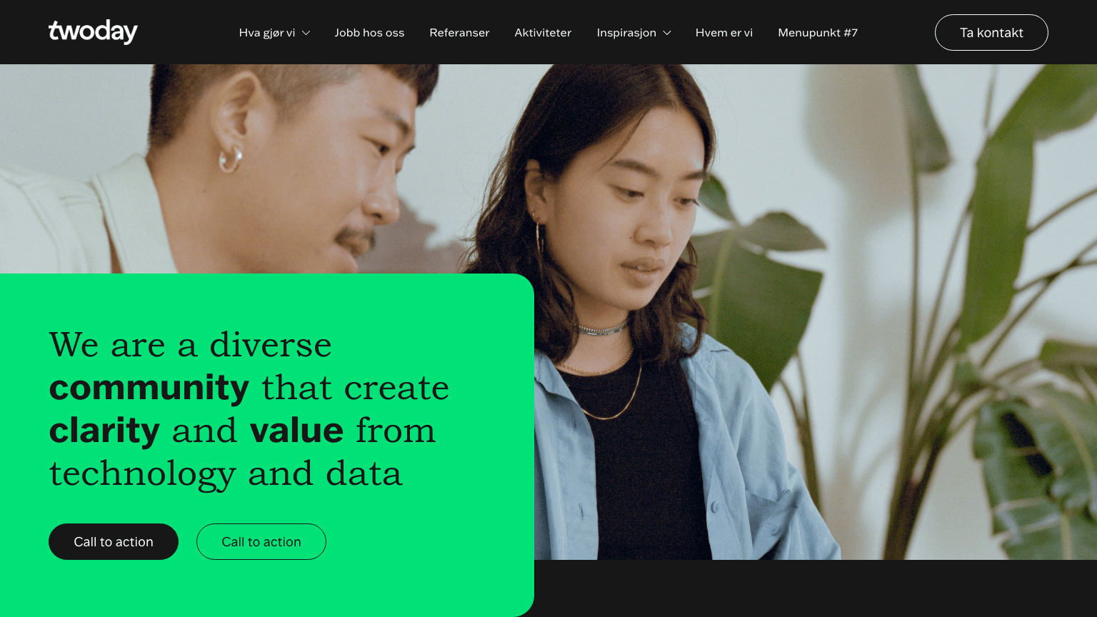
Image + text (left/right)

Image + text can be displayed with the image to the right and to the left. The component is available with all background colors.

twoday-brandhub-design-system-components-text-image-01
twoday-brandhub-design-system-components-text-image-02

Multiple Column

Multiple columns let you create all kinds of different content types. Add columns to create hierarchy in your content or add ‘card-effect’ directly to customers quotes.

twoday-brandhub-design-system-components-multiple-columns-01
twoday-brandhub-design-system-components-multiple-columns-02
twoday-brandhub-design-system-components-multiple-columns-03
twoday-brandhub-design-system-components-multiple-columns-04
twoday-brandhub-design-system-components-multiple-columns-05

Cards

Apply cards in all colors on black or white background color. Add link to the card to create an arrow icon on the card. Choose a different cropping on an image to create a more dynamic card row.

twoday-brandhub-design-system-components-cards-02
twoday-brandhub-design-system-components-cards-01

Video

Showcase video in one column with a YouTube link. 

twoday-brandhub-design-system-components-video

Form

Apply a form component to the page and choose which HubSpot formular should be displayed. The form is not showing before selecting an existing formular. 

twoday-brandhub-design-system-components-form-01
twoday-brandhub-design-system-components-form-02
Twoday-brandhub-design-system-components-form-03

List Columns

Apply list columns to create simple table content. Add up to four columns in the list plus an additional fifth column for link. Add as many rows to the list as you like.

twoday-brandhub-design-system-components-list

Text and icons

Apply text and icons in a card. Add eyebrow, heading and body above icons. Choose icon size and add up to three columns. Only use icons from the twoday download library.

twoday-brandhub-design-system-components-icons