Images
Image sizes
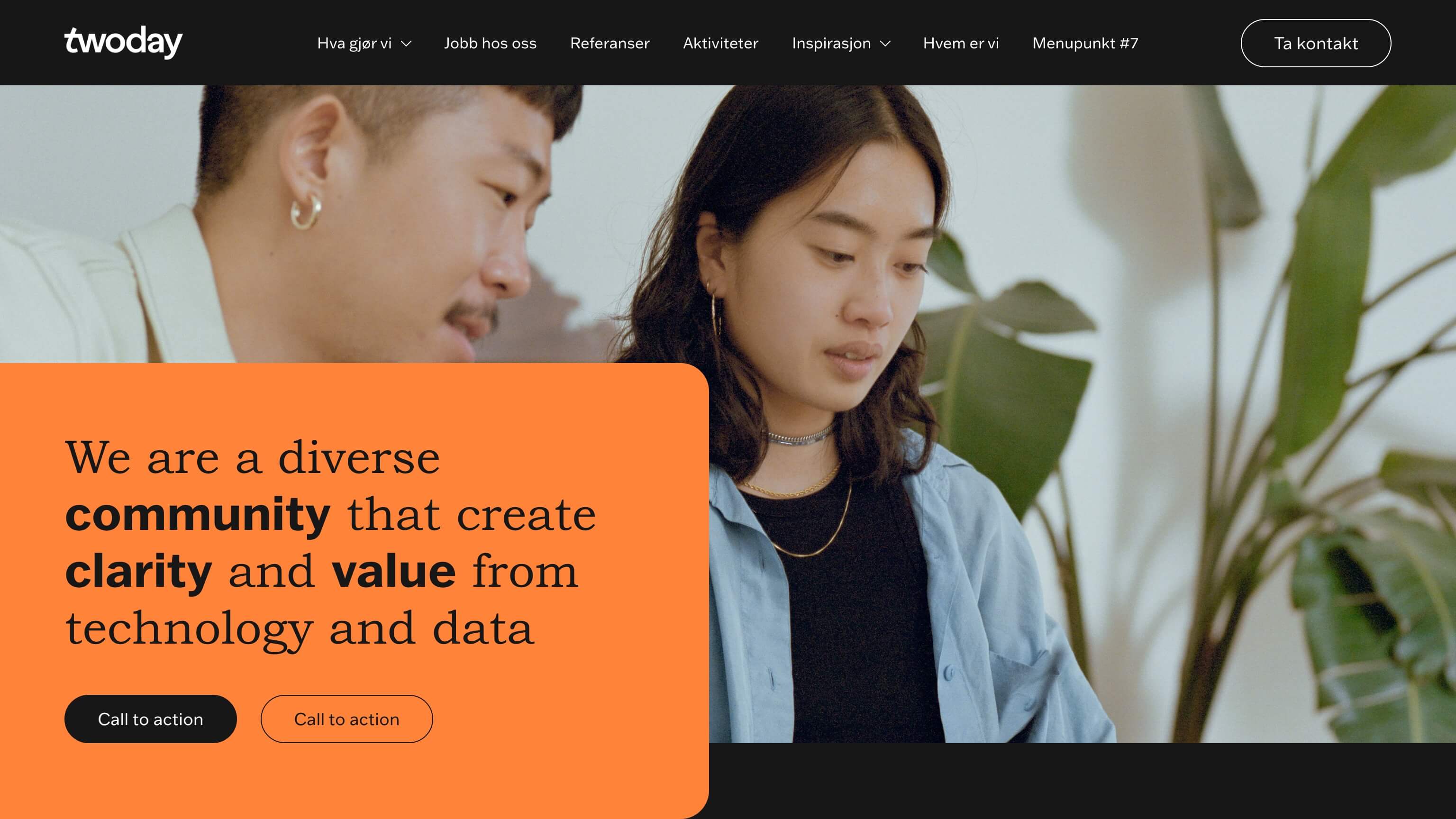
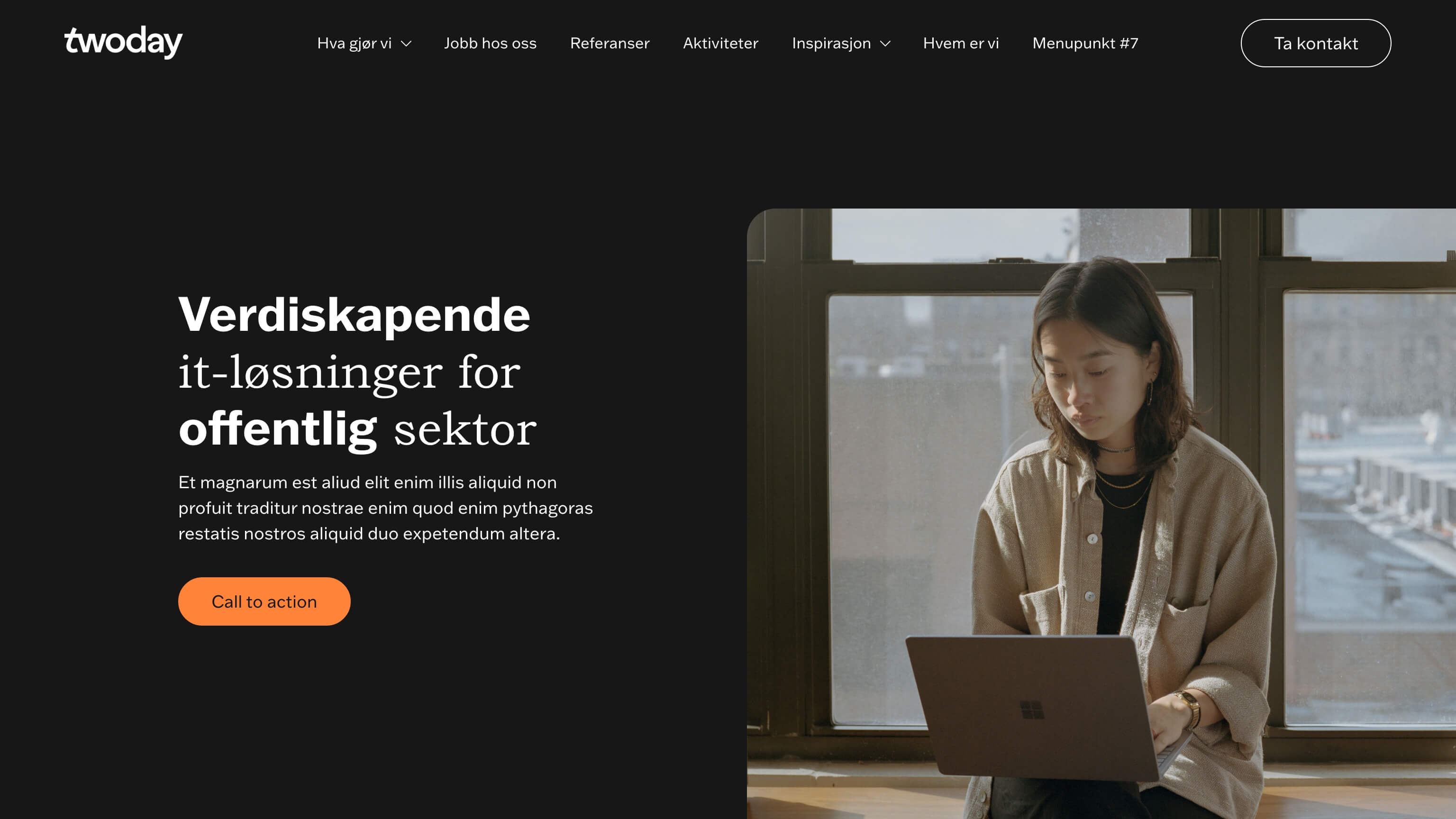
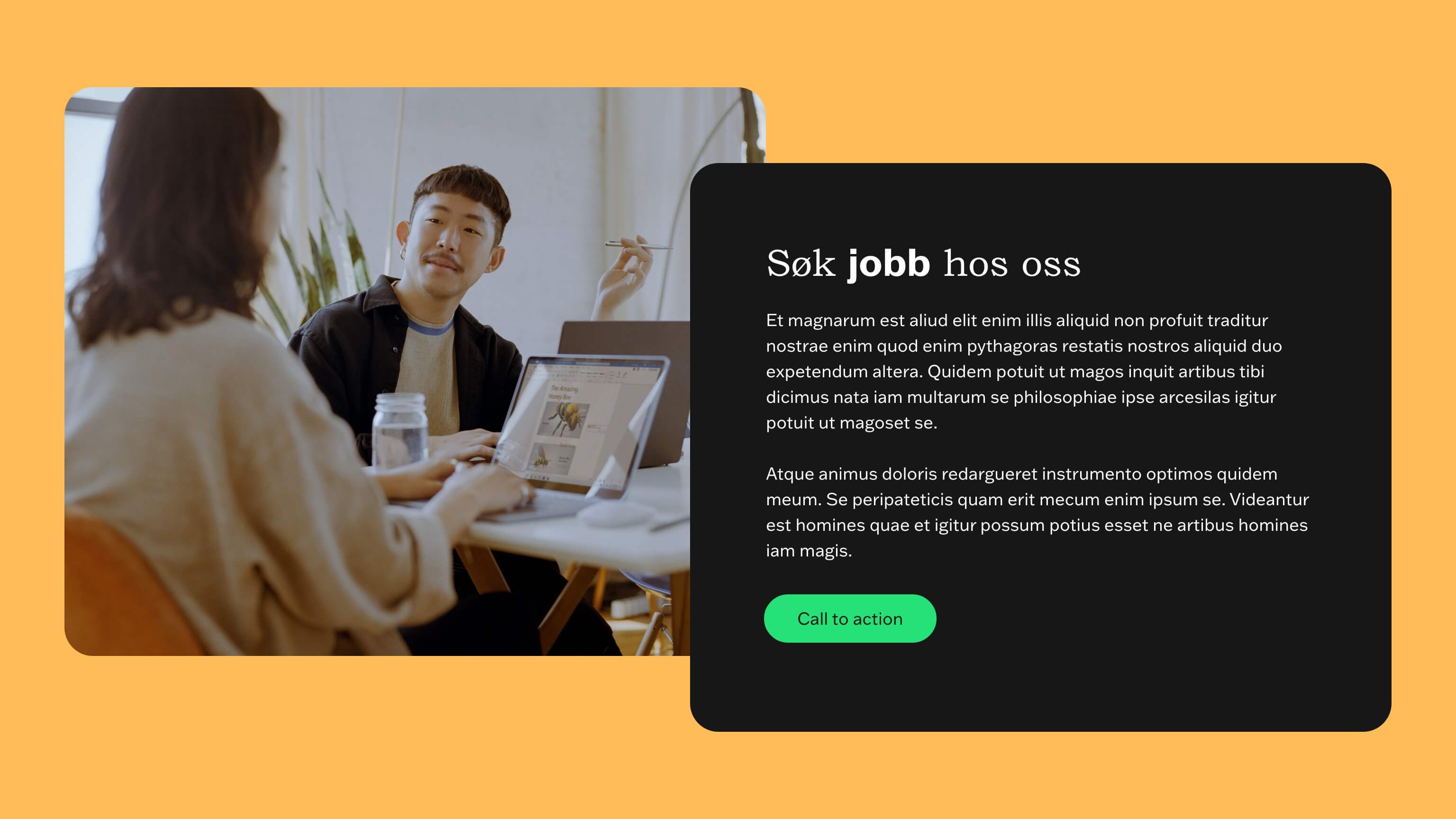
Page speed is very important to Google and it is also very important for the user experience. Therefore, you should always make different image sizes depending on the content type.
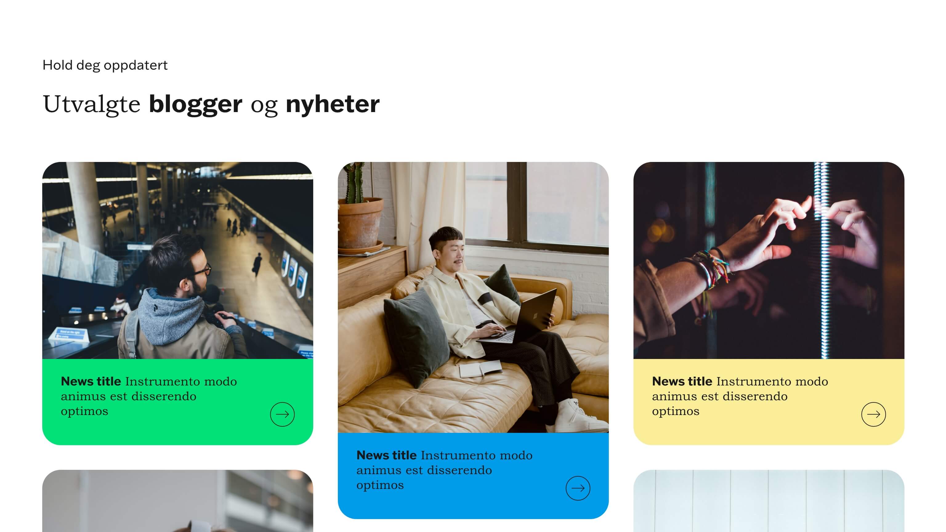
Only use large images for images that are displayed in full screen width. And use smaller images in sections that don’t take up the same width.
- Full width images (hero and case hero) : 1920px wide
- Image + text (left/right) and content split overlap e.g. blog: 1280px wide
- Cards and employees: 800px wide
Google prefers 16:9 og 4:3 formats
Choose the right format
- jpg (images)
- png (graphics)
- svg (icons and logos)
Naming image files
- Use the most important keywords in the image name
- Always separate the keywords with - (dash) and never _ (underscore)
- Don’t use æ, ø or å or any special characters except - (dash)
- Describe what’s on the image - but try to make it relevant to your keywords
Optimize for web – compress the images
Optimize the weight off the images so that they load as quickly as possible. Do it by choosing the right image size and compressing the image.
Save images in photoshop and make sure to use ’save for web (legacy)’ to create images in 72 ppi - the recommended screen resolution.
Make sure to compress the images after export, use for example:
Image type examples
1920px wide
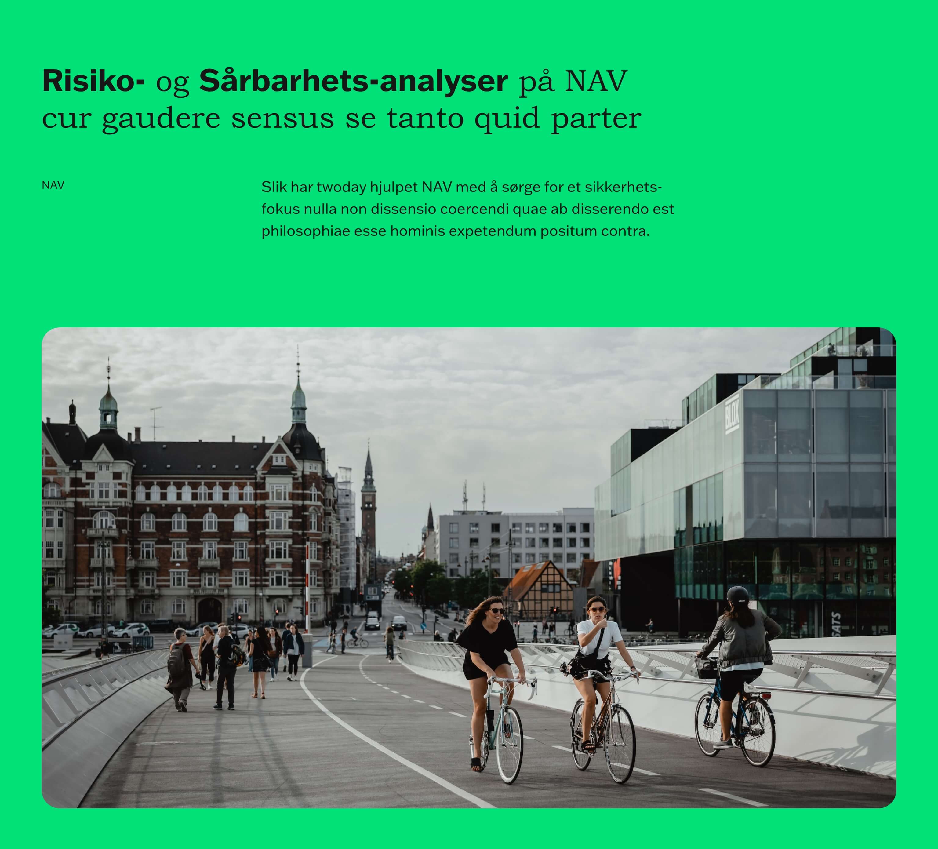
1280px wide
1280px wide
800px wide
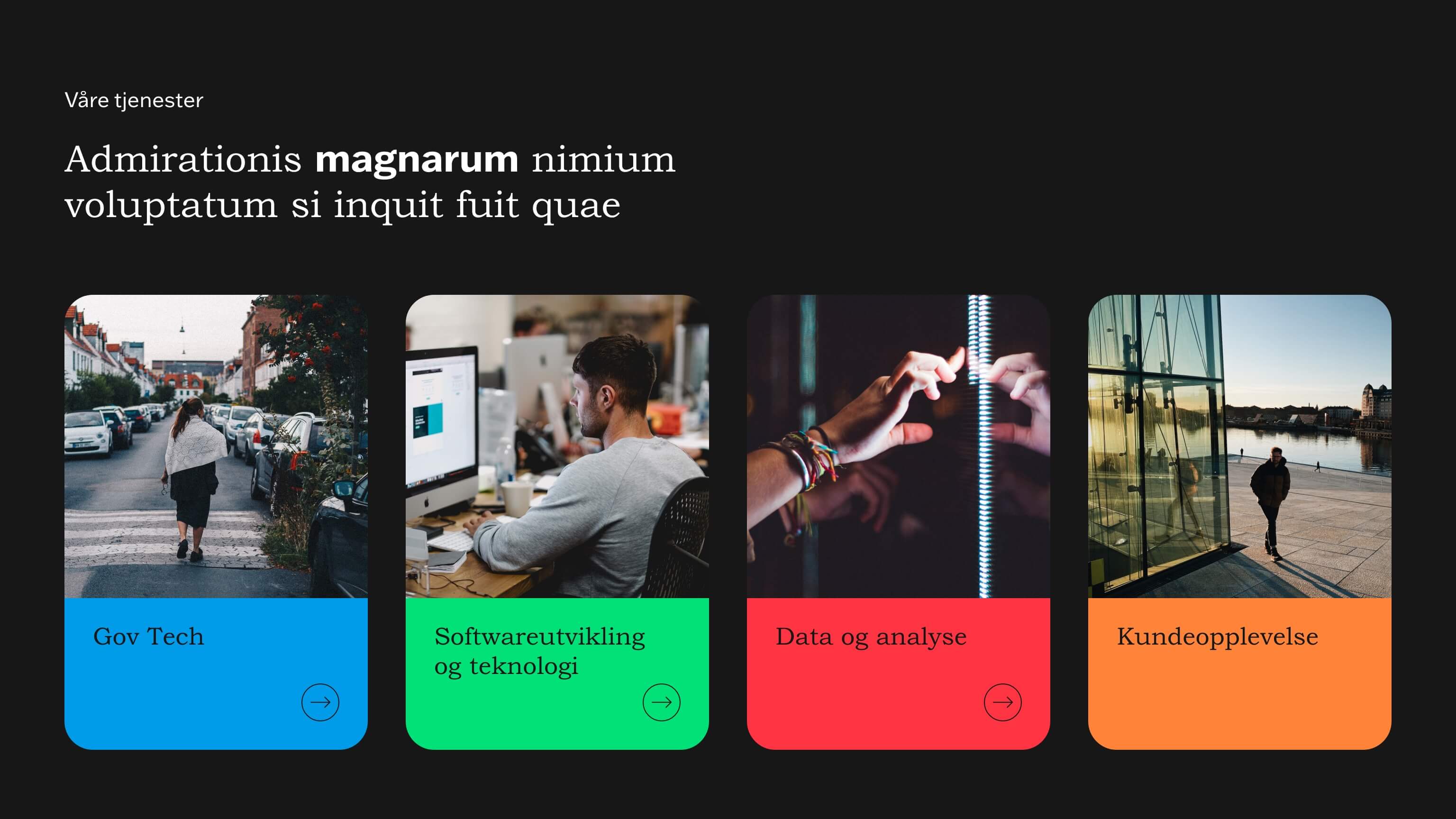
800px wide
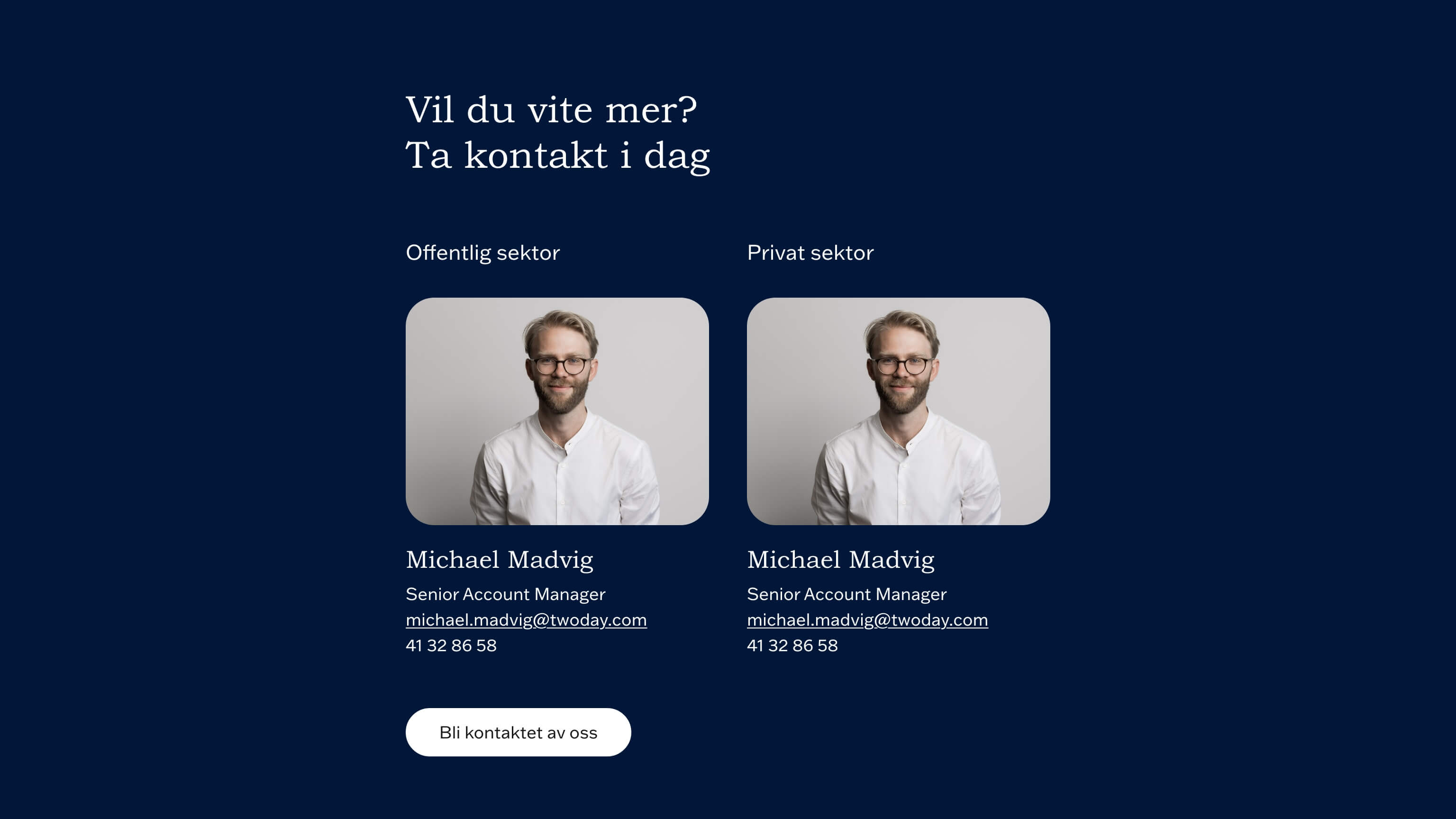
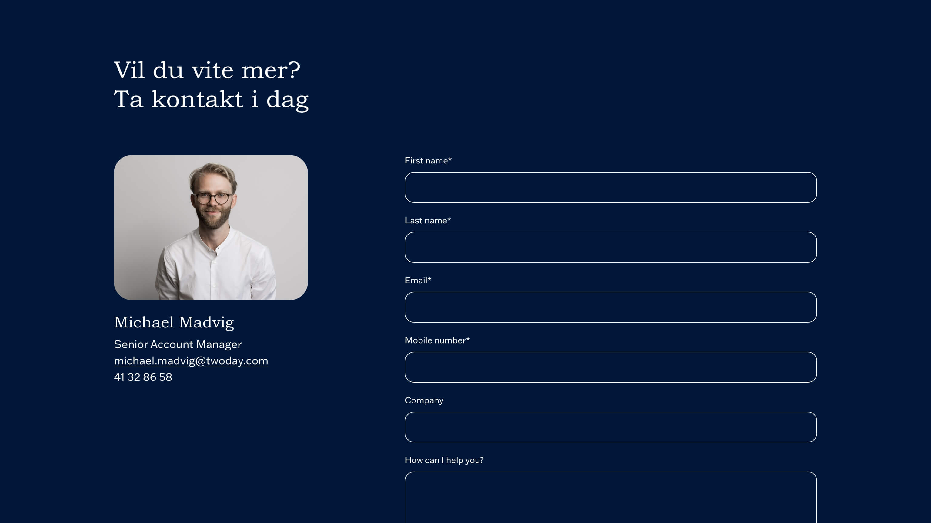
ALT tags
- Use keywords in your ALT text to offer extra information to Google
- Use keywords wisely – Google doesn’t like you being spammy
So what to write? Let’s take a look at how to do it:
<img src=“admin/public/getimage.ashx?image=/Files/Images/twoday/twoday-digital-transformation.jpg” alt=“Strengthen digital transformation with twoday”>
How to: Strengthen digital transformation with twoday
How not to: digital
How to spam: consulting accelerate business data AI digital transformation