Skip to content

Page setup

This section is about composing content pages. The overall impression is paramount, therefore components must always be considered in relation to each other. Clutter makes it difficult to find things – this also applies to digital surfaces. It is important to create order, hierarchy and structure.

Top components

The top component on a page must be eye-catching and it must give a clear indication of the page’s content.

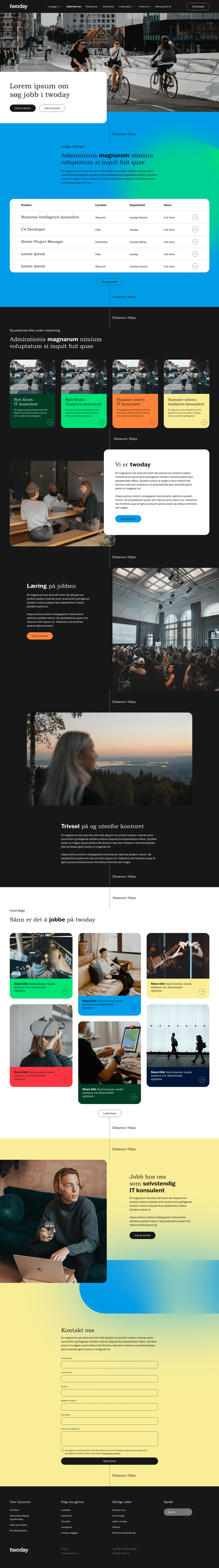
Choose from one of three different top component options; hero banner, image+text and multiple columns.
twoday-brandhub-page-setup-top-components-02
twoday-brandhub-page-setup-top-components-01
twoday-brandhub-page-setup-top-components-03

Use of backgrounds

The various components on a page should give a lively and dynamic expression, but too many colored backgrounds can create clutter and make it difficult for the user to find things. 

Therefore we have one important rule when building content pages; there must always be a black or white background section between any primary brand color background section. There is not any limit to the amount of primary brand color backgrounds there can be on content pages, as long as they are divided with a black or white background section.

The following shows examples on how to combine the colors in a flow down the page.

twoday-brandhub-page-setup-color-flow-02
twoday-brandhub-page-setup-color-flow-01
twoday-brandhub-page-setup-color-flow-03
twoday-brandhub-page-setup-color-flow-04
twoday-brandhub-page-setup-color-flow-05
twoday-brandhub-page-setup-color-flow-06
twoday-brandhub-page-setup-color-flow-07
twoday-brandhub-page-setup-color-flow-08
twoday-brandhub-page-setup-color-flow-09

Distances

There must always be 150 px between component elements.